Interacting with the Dashboards
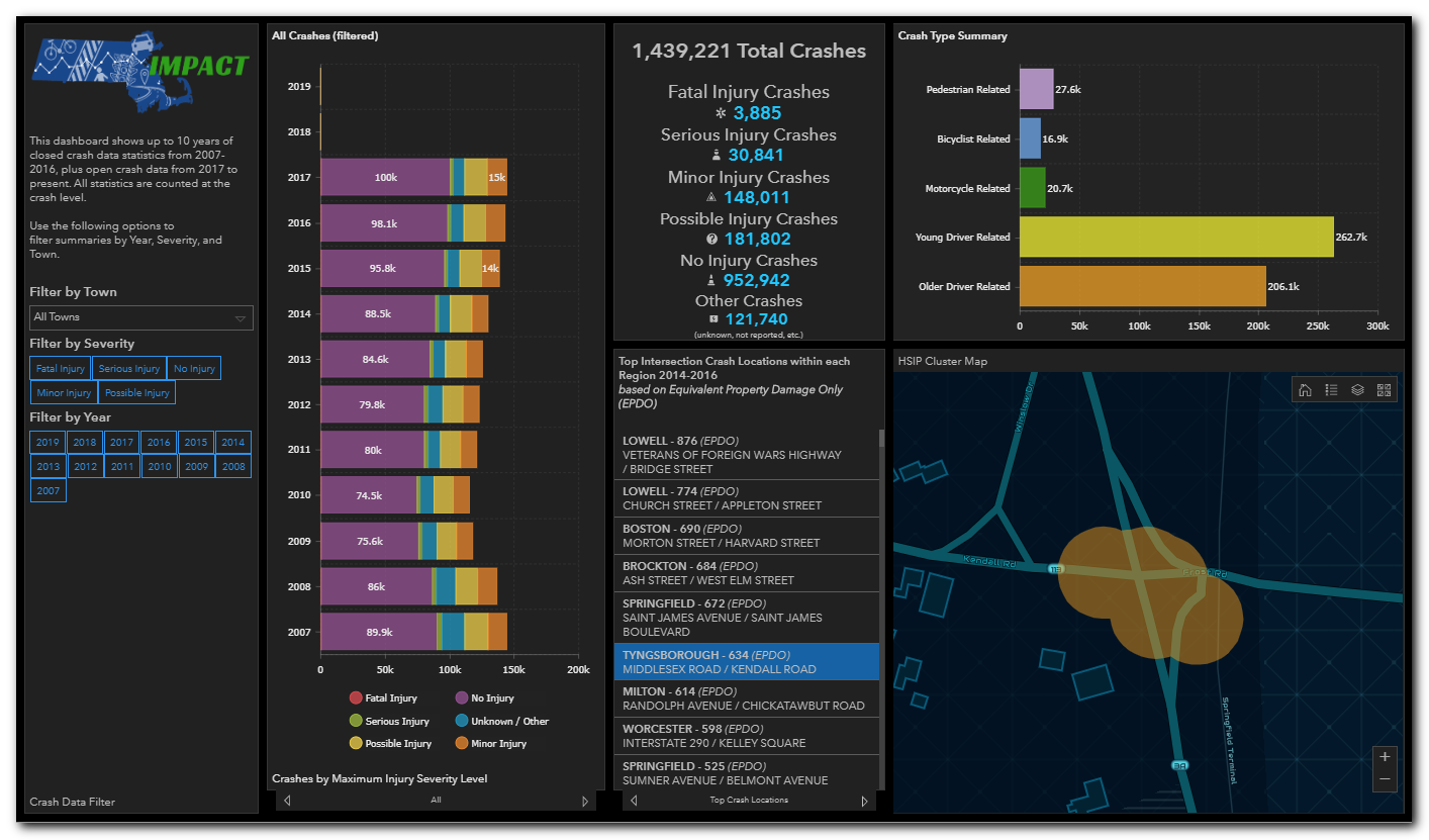
Dashboards are comprised of panels. The panels offer filtering capability, baseline metrics, analysis graphics, or maps. The panels all interact with each other to provide a highly flexible yet holistic view of the data.
Analysis panels can be expanded to the full screen by clicking on the star icon on the upper right of the panel. Your cursor must be in the panel for the icon to show:
Key workflows for interacting with the dashboards includes:
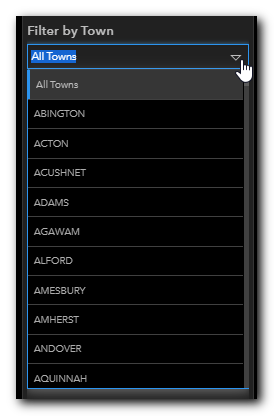
Most dashboards provide a means by which you can filter, or refine, the dataset being displayed. You can filter the data by selecting elements in the drop-down lists. For example, the image below shows selecting a town to filter the results on. Simply click the down arrow and select a town.
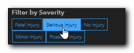
You add additional filters by selecting one or many attributes offered in the filter panel. For example, the image below shows selecting the Serious Injury Severity to filter the results on. Simply click on the selected value, or values and all the analysis panel will update.
![]()
NOTE: Some dashboards may have the Filters panel collapsed by default. Currently the SHSP Emphasis Areas is the only one that has the Filters panel collapsed by default. To show the panel click on the blue triangle icon to the left of the dashboard. The panel will open, and you can configure the filters.
(1).png)
If you would like to keep the panel open, click on the pin icon in the upper right of the panel. To unpin the panel, click the pin icon again.
.png)
.png)
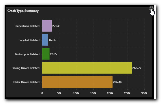
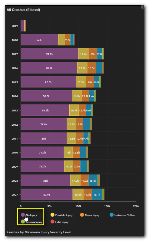
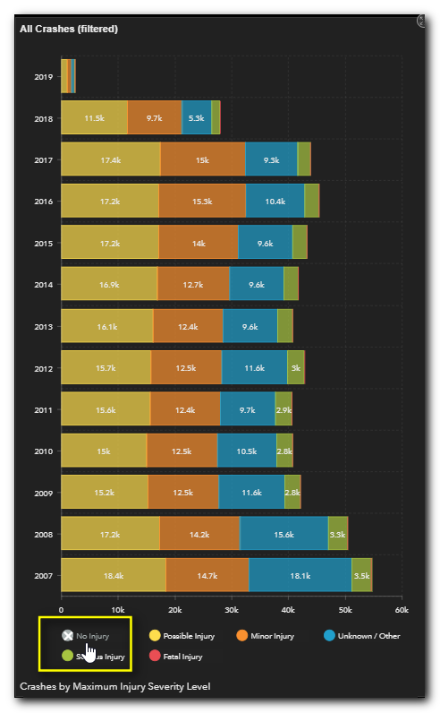
NOTE: If a chart has a legend associated with it in the panel you can use the legend to hide specific data points. To do so simply click on the legend swatch. The associated data point will be removed from the chart. To show it again, click on the swatch again.
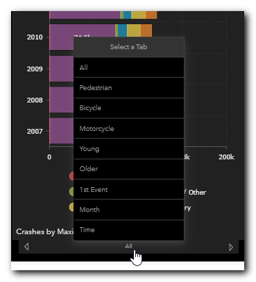
The analysis panels often contain many screens each representing a value that make up the analysis. For example, the image below shows selecting one of several data sets analyzed by Maximum Severity Level. Click on the "All" button on the bottom of the analysis panel to see the options. The same options may be represented by tabs depending on your screen resolution or if the panel is in full screen mode. You may also click the right or left arrows to navigate through the options one by one.
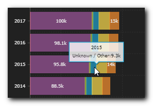
You can view specific values by hovering your cursor over the chart elements. For example, the image below shows the 2015 value for Maximum Severity Code for the Unknown/Other category by hovering the cursor over that dataset and point in the chart.
Many dashboards show spatial data as well in a map panel. These map panels are also highly interactive. They will respond to selected elements, such as towns, by zooming to them. You can also manually click-and-drag the maps to reposition it or use the "+" and "-" buttons to zoom in and out. You can also use your mouse scroll wheel to zoom in and out.
To reset the map to its default extent you can click the Home button.
.png)
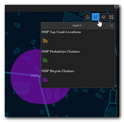
To view the map legend, click the Legend button.
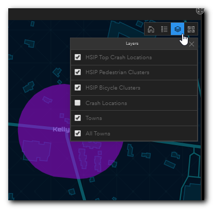
To view the map layers, click the Layers button. Within the Layers panel you can turn on and off layers by checking/unchecking the boxes.